Burndown
Visualisation of work left to do within a specified time period
What is it?
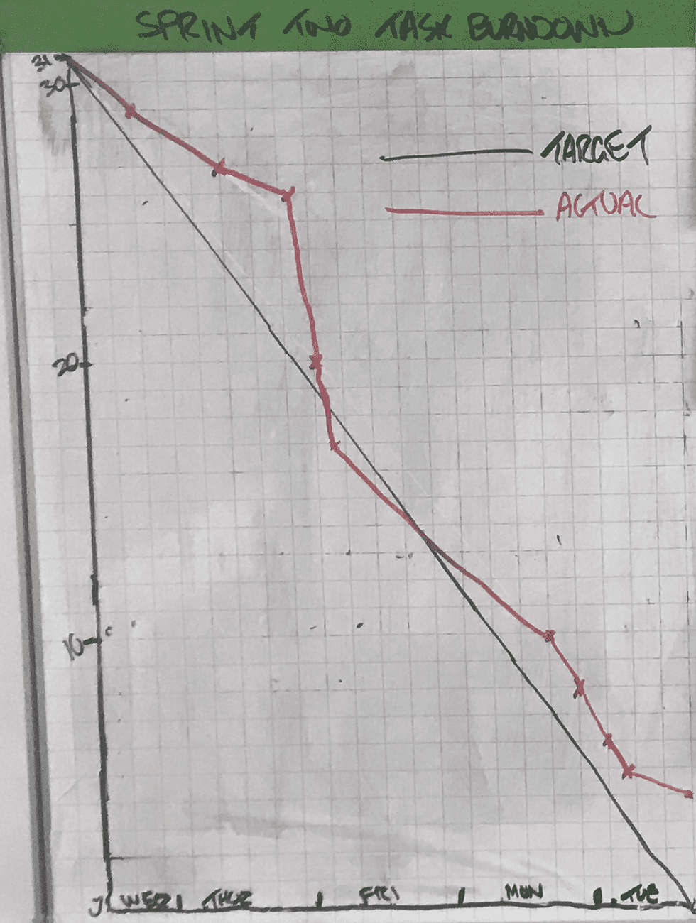
A burndown chart is a visualisation of work left to do within a specified time period. The remaining work (or backlog) is often on the vertical axis, with time along the horizontal.
Teams often use burndown charts to track progress within fixed time periods (for example, Sprint Burndown charts). They can also be used to visualise progress for longer time periods and milestones (for example, Release Burndown charts).
Why use a Burndown chart?
Burndown charts provide real data about a team’s velocity and provides a mechanism as to whether the team’s current velocity and trajectory will result in it meeting its committed goal(s).
Related Practices
Retrospectives provide excellent opportunities to review recent burndown charts and to facilitate conversations on what can be learned from the data presented in them.
Facilitation Materials Needed
- A large piece of flip-chart paper - ideally with gridded lines.
- Flip chart pens
- Long ruler
How Do I do it?
- Draw a horizonatal and vertical lines on the flip-chart
- Mark the horizontal axis with the time measurement (for a Sprint Burndown, this is likely to be each day in the Sprint)
- Mark the vertical axis with the work being measured (this may be number of tasks, number of stories/features, number of story points or estimated time)
- Draw a diagonal line connecting the maximum work units to the last time measurement - this line represents the target/aspirational trend line
- As work is complete, draw a line (in a differnt color) representing the time point the remaining work has ‘burned down’ and how much work is remaining
- Re-visit and discuss what information the chart is radiating with the team and interested stakeholders.